Watch This Space: Top Brand Trends Of 2021/2022
The brand trends that are emerging and set to dominate 2021 and 2022 are some of the most interesting we’ve seen in a long time. And that’s because they all appear to have the same principal values at their core.
Looking through this list of top brand trends for 2021/2022 is like peering into a cleansing care package. There is a shift toward natural influences. A purge of unnecessary extravagance. Ultimately the big trends are all about hitting the reset button, looking after ourselves, and being open with each other.
So, here is our round-up of the top brand trends to consider for your business in 2021/2022:
Minimalism
Who knew bland could be the new brand?
But it makes perfect sense. Brand trends are not random, they’re often intimately tied to social concerns. And isn’t there just so much stuff?
As we turn our attention toward how we can protect the environment from the sheer amount of disposable commodities we produce, this attitude naturally finds its way into branding trends.
Don’t know about you, but we are fed up with all the clutter, and this is why we will continue to see many brands stripping back to their simplest form in 2021 and 2022.
We’re loving this trend and what it stands for. But beware of simplifying your brand to the point of becoming boring or indistinguishable. Before incorporating minimalism into your business, you will need to consider other ways to make your brand pop.
Super Simple UX
If there’s one thing we would implore you to avoid when building your brand in 2021, it’s making your consumers jump through hoops to access your content. Accessibility is a key brand trend this year.
This one goes hand-in-hand with minimalism, so it’s really easy and effective to incorporate both these trends into your business at the same time. It’s definitely worth investing in the creation of a sleek and intuitive user experience for your website.
Consumers have so much content to sift through these days, and if you make them work for it, they’ll move on in the click of a button. You want to get them clicking on your button. If UX design has not been one of your top priorities, start making it one now.
Imperfect Illustrations
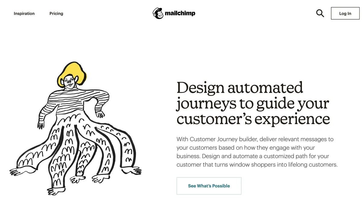
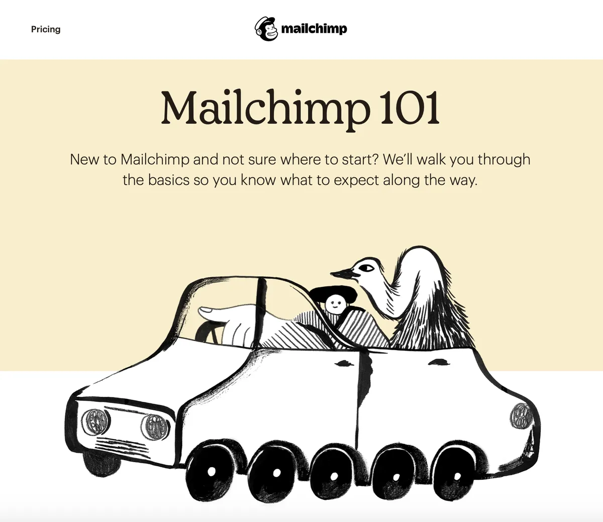
Out with digitised straight lines, in with the hand-drawn rough cuts. Organic and irregular illustrations are a great way for your brand to communicate a feeling of authenticity.
In 2021 and 2022, try and imbue your brand’s design with illustrations that have that distinctive hand-drawn style or elements of open imperfection. These are indicative of a personality behind the screen that will resonate with consumers.
Though we have spent much of this past year separated from one another, brands are all about people, people, people. Now more than ever. Splash a bit of character onto your landing page, and don’t let a computer speak for you.
Examples of this brand trend below from Mailchimp:


You'll notice that Mailchimp have successfully taken the minimalist approach here too. They've also incorporated muted colours, which brings us to the next item on the list...
Nature
In this uncertain world, consumers are craving a shift toward stability. And what is more timeless than Mother Nature herself?
In-your-face fonts and garish, neon colour palettes aren’t really gelling with people so much anymore. We are seeing these styles get subbed out for muted, natural colour palettes, and patterns inspired by natural textures.
All things reminiscent of the natural world are a big one to look out for when considering brand trends for this year.
Dark Mode
Despite having had dark mode on our iPhones for years, this trend is a rather novel, but important one. It may sound like a small thing, but considering the amount of time we spend looking at screens, it’s actually crucial.
We are seeing more and more brands optimise their sites and apps for dark mode as our screen usage increases, and consumers are looking for ways to look after their eyes and reduce strain.
The theme of self-care and wellbeing continues with this brand trend. Incorporating a dark mode option into your user-interface is a simple modification that will set you apart as a forward-thinking brand. One that cares about the wellbeing of its consumers.


